
Why Pattern Choice Matters More Than You Think
When most homeowners choose tile, they spend the majority of their time selecting color, finish, and material. Layout pattern often becomes an afterthought - a decision made in the tile showroom without fully imagining how it will read across an entire floor or wall. That's a costly oversight.
The same 4×12-inch subway tile can make a bathroom feel crisp and vertical, elongated and horizontal, or subtly dynamic - purely based on how it's set. Pattern controls the eye's movement through a space, influences perceived proportions, and sets the room's visual tone before a single piece of furniture arrives.
If you're planning a renovation, understanding what each layout actually does to a room will help you make a more confident, informed choice. For broader project planning, see our bathroom renovation planning guide for a room-by-room reality check.
Straight Stack (Grid Pattern)
The straight stack sets tiles in perfectly aligned rows and columns - all vertical and horizontal joints line up continuously. It's the most structured, geometric of all layouts and produces a clean, orderly appearance that works well in contemporary and minimalist interiors.
The trade-off is that it emphasizes any irregularity in the tile itself or the substrate beneath it, since the eye naturally follows those long, unbroken grout lines. On large-format tiles in an open space, it reads as calm and architectural. On smaller tiles in a tight room, it can feel rigid and grid-heavy.
Straight stack creates maximum order but exposes every substrate imperfection through unbroken grout lines.
Running Bond (Brick Pattern)
Running bond offsets each row by half a tile length - the pattern most people associate with brick walls. It's one of the most forgiving layouts in terms of installation and one of the most versatile visually. The staggered joints break up continuous lines and soften the overall appearance compared to a straight stack.
Orientation matters considerably here. Set horizontally, running bond lengthens a wall and lowers perceived ceiling height - useful in a tall, narrow space. Set vertically, it draws the eye upward and can make low-ceilinged rooms feel taller. This is a key reason subway tile in a shower is often laid vertically in bathrooms with standard eight-foot ceilings.
Rotating running bond from horizontal to vertical can visually raise a low ceiling with no extra materials.
Herringbone
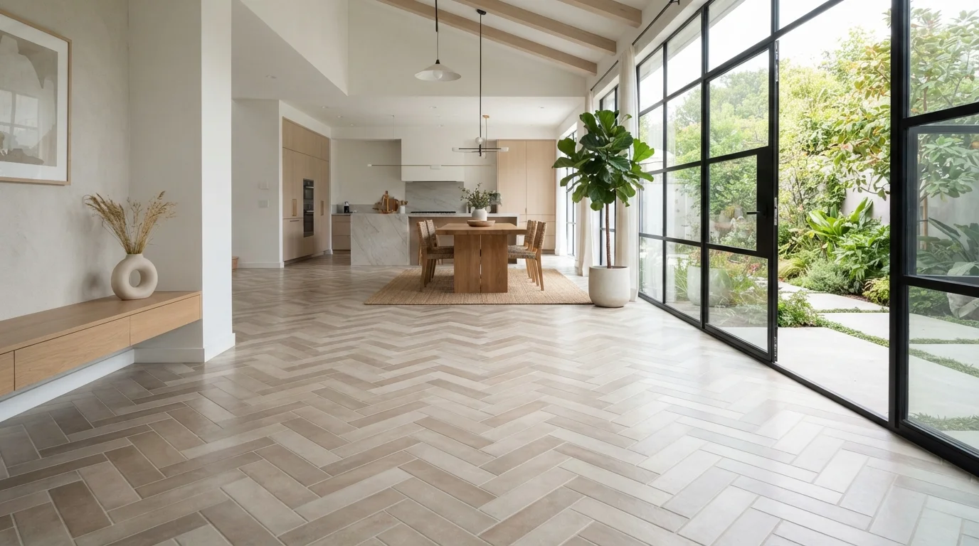
Herringbone arranges rectangular tiles at 90-degree angles to each other in a V-shaped zigzag. The pattern has strong directional energy - it guides the eye along its axis, which makes it particularly effective in hallways and narrow rooms where you want to pull attention forward and extend the perceived length of the space.
Because each tile is cut at an angle relative to the room's walls, herringbone requires more precise installation and generates more material waste than straight patterns. It also demands a skilled installer who can maintain the pattern's alignment over a long run. The visual payoff is a dynamic, textured surface that adds considerable character to otherwise simple tile.
Herringbone's directional energy makes narrow hallways feel longer and more intentional.
Diagonal (Diamond Pattern)
Setting square tiles at 45 degrees to the room's walls creates a diagonal or diamond pattern. This is one of the most reliable techniques for making a small room feel larger because the eye follows the diagonal lines - the longest axis of the space - rather than being interrupted by grout lines that run parallel to the walls.
The perimeter of a diagonally-set floor requires cut triangles along every wall, which adds to both labor time and material waste. Rooms with irregular shapes or many obstacles (toilets, vanities, islands) become significantly more complex to tile diagonally. In a straightforward rectangular room, however, the spatial payoff often justifies the extra effort.
Diagonal tile orientation follows the room's longest axis, consistently making small rooms appear more spacious.
Basketweave
Basketweave groups small rectangular tiles around a central square tile (or simulates this effect with a single molded piece) to create an interlocking, woven appearance. It's a classic pattern strongly associated with traditional, Craftsman, and period-revival interiors.
Because it relies on tight groupings and multiple tile sizes, basketweave reads as a busy surface up close. In small quantities - a bathroom floor, a fireplace hearth, a shower pan - it creates rich visual texture and a sense of craftsmanship. Applied across a large open floor, it can feel overwhelming and may work against the room's sense of calm. Scale your use of this pattern accordingly.
Basketweave rewards restraint - its intricate texture is most effective in contained, smaller surface areas.
Large-Format Single Tile
While not a pattern in the traditional sense, using large-format tiles (typically 24×24 inches or larger) with minimal grout lines creates its own powerful spatial effect. Fewer grout lines mean fewer visual interruptions, which makes floors and walls appear to recede - expanding the perceived size of a room considerably.
Large-format tile is particularly effective in open-plan spaces where the goal is visual continuity across a wide area. It also reduces cleaning effort over time. The installation requirement is more demanding, however: the substrate must be exceptionally flat and level, as large tiles bridge imperfections rather than conforming to them the way smaller mosaic tiles do. This is work best evaluated - and often performed - by an experienced tile setter.
Fewer grout lines from large-format tiles create visual continuity that makes any room feel more expansive.
Choosing the Right Pattern for Your Space
No single layout pattern is universally superior. The right choice depends on room size, ceiling height, the tile's own proportions, and how much visual activity you want the surface to carry. Larger, more open rooms can absorb busier patterns without feeling cluttered; smaller rooms often benefit from simpler, directional layouts that push the eye outward.
Test Before You Commit
Before finalizing a pattern, sketch your room to scale on graph paper and draw the tile layout over it. Many tile manufacturers also offer free digital visualization tools. Even a rough mockup reveals whether a pattern will feel proportionate or feel out of scale in your specific space.
Grout color and joint width amplify or quiet any pattern. Wide grout lines emphasize the grid structure of a layout; tight, tone-on-tone grout softens it and lets the tile shape take over. Neither approach is wrong - they just produce different results, and it's worth testing both on a sample board before committing.
The same principles that govern tile layout - directing movement, establishing zones, creating rhythm - also apply to how rooms function overall. The concept of dedicated zones in home organization draws on similar spatial logic.